Luet oppimateriaalin englanninkielistä versiota. Mainitsit kuitenkin taustakyselyssä osaavasi suomea. Siksi suosittelemme, että käytät suomenkielistä versiota, joka on testatumpi ja hieman laajempi ja muutenkin mukava.
Suomenkielinen materiaali kyllä esittelee englanninkielisetkin termit.
Kieli vaihtuu A+:n sivujen yläreunan painikkeesta. Tai tästä: Vaihda suomeksi.
Chapter 12.4: GUIs with the Swing Library
Introduction
First: a llama program
Fetch the SwingExamples module and run o1.llama.LlamaApp.
The application has a GUI with a single window. The window’s contents are divided in three parts: there’s some text at the top, an image in the middle, and a button at the bottom. The program reacts to mouse clicks and the mouse wheel. Try it.
Chapter outline
Chapters 2.7 and 3.1 discussed how you can represent a graphical view as an object and give it methods that handle GUI events. Which is pretty much all you need to learn about GUIs in O1, officially. However, since it’s fun and useful to learn some more about this very concrete topic, we’ve included this optional chapter in the ebook.
Back in the early weeks, we also noted that there are assorted GUI-building libraries for
programmers to pick from. So far in O1, you’ve used O1’s custom library, especially its
classes View and Pic. In this chapter, we’ll use a different toolkit.
By the time you finish the chapter, you should understand how the llama app’s GUI works. However, it makes sense to start with a few simpler examples that teach you how to work with individual GUI elements: buttons, text fields, and the like. Here’s what’s coming:
a few words about GUI libraries in general;
using individual GUI elements via the REPL; adjusting component properties;
laying out multiple components;
giving an app a GUI;
reacting to GUI events: mouse clicks, etc.;
a closer look at
LlamaApp;another example GUI: an app that generates random text; a related practice task.
GUI Libraries
One of Scala’s libraries is a GUI library named Swing. Alternatives to this library exist, but Swing is what we’ll use in this chapter.
O1’s View and Pic are particularly handy then the GUI you need is fairly simple
and consists of pictures or geometric shapes that are positioned relative to each other.
O1’s toolkit also gives your apps a steadily ticking clock that is easy to use but
limited in functionality.
Swing is rather less wieldy but works for a wider variety of purposes.
The Swing library consists of classes that represent a variety of GUI elements: there’s a class for buttons, another for windows, still another for menus, and so forth. In your own applications, you can instantiate these classes and combine the various objects as fits your needs. You may also define new kinds of GUI elements by having your classes inherit from the library classes.
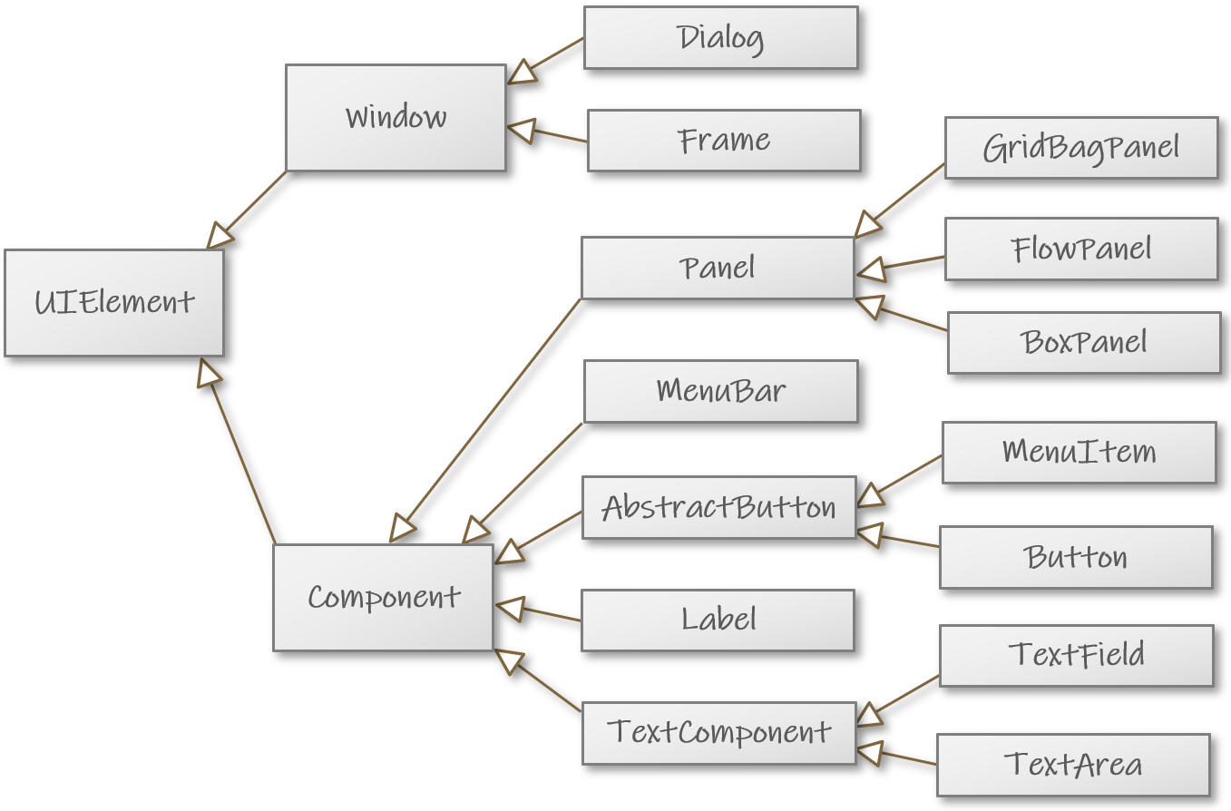
The following diagram is replicated from Chapter 7.5. It shows the relationships between some of the main classes in the Swing library; you’ll see examples of most of them in this chapter.
What GUI libraries are there other than Swing?
Among Java libraries, Swing’s competitors include JavaFX, which has a Scala equivalent in ScalaFX.
Qt Jambi and Tcl/Tk are two more examples of well-known GUI libraries.
Some functional programmers adopt a reactive approach to building GUIs.
In a web application, the GUI may take the form of one or more web pages. Web browsers commonly execute JavaScript, but it is possible to embed user-interface code written in Scala onto web pages: Scala.js compiles Scala into JavaScript.
GUI Elements
A frame
Let’s create a GUI element via the REPL. Follow along! As you launch the REPL, select the SwingExamples module.
First, we’ll create a window, also known as a Frame. Frames are reminiscent of the
View objects you know from package o1.
import scala.swing.*val myWindow = Frame()myWindow: scala.swing.Frame = scala.swing.Frame$$anon$1[frame0,0,0,0x0,invalid,hidden, ... ]
Even though no window appeared onscreen yet, we now have a new Frame object that
represents a GUI window. Its toString method returns a litany of window properties,
which the REPL prints out.
An instance of Frame is capable of displaying itself onscreen. It doesn’t actually do
that, though, since a newly created Frame is invisible by default. We need explicitly
to change that:
Adjusting a GUI element’s properties
A Frame’s visibility is governed by its visible property:
myWindow.visible = truemyWindow.visible: Boolean = true
As soon as you issue that instruction, the window shows up. It may be hard to spot at first, though, since it’s tiny and may be located at the top corner of your display.
You can move the window and resize it just like you can do with other windows in your operating system.
If you click X to close the window, the window merely becomes invisible and you can bring
it back by making it visible again.
The window doesn’t have a title yet. You can give it one by changing the Frame
object’s title property:
myWindow.title = "Experiment"myWindow.title: String = Experiment
Try that, and you’ll see an immediate change in the window title.
A button inside a window
Let’s add a button to the window. First, we need an instance of Swing’s Button class:
val myButton = Button("Press here")( () )myButton: scala.swing.Button = scala.swing wrapper scala.swing.Button$$anon$1[,0,0,0x0, ... ]
... we have just some empty brackets for now to mark that our button isn’t associated with any behaviors. Later in this chapter, you will learn a couple of ways to make buttons react when pressed.
We’ve created another GUI element that doesn’t automatically show up. Even though we have a button object and a visible window, our code doesn’t specify that the button should be part of the window.
If all we want inside our window is that one button, this is all we need:
> myWindow.contents = myButton myWindow.contents: Seq[scala.swing.Component] = List(scala.swing wrapper scala.swing.Button$$anon$1 ... )
Now the window will look like this:
You can press the button. It gets pressed, but nothing really happens as consequence.
You’ll have noticed that Swing Frames don’t have a makePic method like o1.Views
(Chapter 2.7) do. We didn’t construct a picture of the Swing frame; we compose the
window’s contents from GUI elements. Correspondingly, the tools for laying out a Swing
GUI are different from the ones you know from o1.Pic (place, leftOf, etc.).
Using panels to lay out components
A Swing Frame’s contents property specifies which GUI component should appear within
the window frame. Above, we created a window whose entire contents consist of a single
button object.
Only a single element may be stored in contents at any given time. However, we’d
usually like our GUI windows to contain multiple components. We might want to create
this window, for instance:
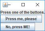
The problem is solved by putting components inside one another. Components that go together can be grouped into a panel (paneeli), which panel you can then set as the window’s contents. A panel is a GUI component that can contain multiple other components.
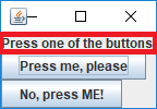
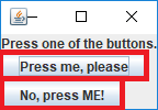
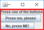
Let’s break down the above image:
The window and its title bar are represented by a Frame object.
A label is a GUI element that contains some text, an image,
or both. Swing provides a class scala.swing.Label.
As you already saw, there’s a class scala.swing.Button for buttons.
This window’s contents isn’t either of the buttons or the label but a panel that contains all those three. One of that panel’s properties is that it organizes its contents in a vertical column.
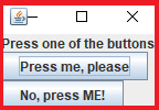
It isn’t hard to create that window. Let’s start by creating the two buttons and the label:
val firstButton = Button("Press me, please")( () )firstButton: scala.swing.Button = scala.swing wrapper scala.swing.Button$$anon$1[,0,0,0x0, ... ]
val secondButton = Button("No, press ME!!")( () )secondButton: scala.swing.Button = scala.swing wrapper scala.swing.Button$$anon$1[,0,0,0x0, ... ]
val prompt = Label("Press one of the buttons.")prompt: scala.swing.Label = scala.swing wrapper scala.swing.Label$$anon$1[,0,0,0x0, ... ]
Now to create a panel that lays out those pieces:
val allPartsTogether = BoxPanel(Orientation.Vertical)allPartsTogether: scala.swing.BoxPanel = scala.swing wrapper scala.swing.BoxPanel$$anon$1[,0,0,0x0,invalid,
layout=javax.swing.BoxLayout, alignmentX=0.0,alignmentY=0.0,border=,flags=9,maximumSize=,minimumSize=,preferredSize=]
BoxPanel is a particular sort of panel: a BoxPanel’s
contents are laid out either horizontally or vertically.
Vertical is a constant. We use it to mean that we want the
components in the panel to appear one below the next. (Vertical
is a member of the singleton object Orientation, which also
provides Horizontal.)
The panel has a contents variable whose type is Buffer[Component]: a bufferful of
GUI components. Adding components to the panel is just a matter of manipulating that
buffer. We could write things like allPartsTogether.contents += prompt to add a single
component at a time. Or we can use ++= to add multiple components in one go:
allPartsTogether.contents ++= Vector(prompt, firstButton, secondButton)res0: Buffer[Component] = Buffer(scala.swing wrapper scala.swing.Label$$anon$1[,0,0, ... ]
We have a panel that contains the buttons and the prompt. Now let’s create a window with that panel as its contents:
val buttonWindow = Frame()buttonWindow: scala.swing.Frame = scala.swing.Frame$$anon$1[frame1,0,0,0x0, ... ]
buttonWindow.contents = allPartsTogetherbuttonWindow.contents: Seq[scala.swing.Component] = List(scala.swing wrapper scala.swing.BoxPanel ... )
buttonWindow.visible = truebuttonWindow.visible: Boolean = true
The two-button window appears onscreen.
Notice that the order in which we created the Button and Label objects made no
difference to their layout within the window. That layout is determined by the objects’
order within the panel’s contents buffer. In this example, we put the prompt first,
followed by the buttons.
Displaying images
In the previous example, we used a label to display text. The Label class can do more:
a label can display an image instead of text (or both so that the text captions the image).
For loading existing images, you can use the Swing class ImageIcon: when you create an
ImageIcon object, you can specify where the image data is located. You can load an image
from a local file within the module folder, elsewhere on your computer, or a network URL.
(In this respect, ImageIcon is like o1.Pic.)
As an experiment, let’s create this window:
The REPL session below demonstrates how to do that: it creates a Label that displays
an image from the internet.
First, let’s import the ImageIcon class and the URL class we’ll use for representing
online addresses:
import javax.swing.ImageIconimport java.net.URL
The tools we use are originally part of Java’s standard library.
Here’s a Label with no text:
val imageLabel = Label()imageLabel: scala.swing.Label = scala.swing wrapper scala.swing.Label$$anon$1[,0,0,0x0, ... ]
Instead of adding text, we’ll assign to the label’s icon variable. We’ll tell the label
to display an image that is available at a particular URL:
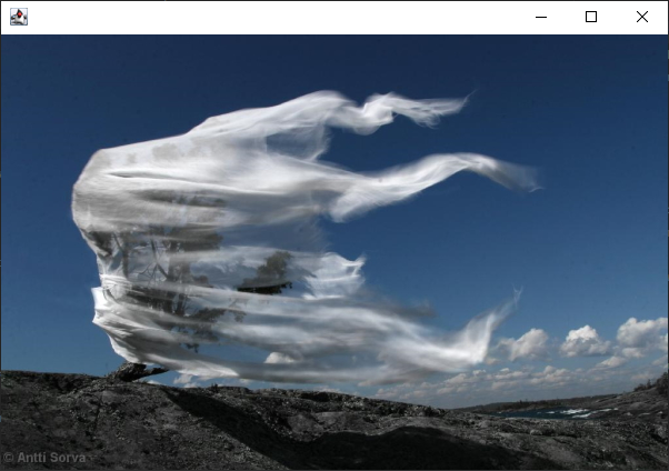
val examplePicURL = URL("https://gitmanager.cs.aalto.fi/static/O1_2024/_static/pics/misc/aiolos.jpg")examplePicURL: URL = https://gitmanager.cs.aalto.fi/static/O1_2024/_static/pics/misc/aiolos.jpg
imageLabel.icon = ImageIcon(examplePicURL)
We still need a window that contains that label:
val imageWindow = Frame()imageWindow: scala.swing.Frame = scala.swing.Frame$$anon$1[frame5,0,0,0x0, ... ]
imageWindow.contents = imageLabelimageWindow.contents: Seq[scala.swing.Component] = List(scala.swing wrapper ... )
imageWindow.visible = trueimageWindow.visible: Boolean = true
javax.swing?
It may seem odd that one of the packages we used is named
javax.swing. The Scala library that we’re using here is built
upon an identically named library that was originally designed
for Java.
Scala programmers make use of Java libraries when it’s convenient.
For instance, the current version of Scala’s Swing doesn’t provide
its own ImageIcon class; then again, it doesn’t need to, since
we can use the class from Java’s Swing.
The letter x — for eXtension — appears in the name of the Java package for historical reasons.
Dialogs
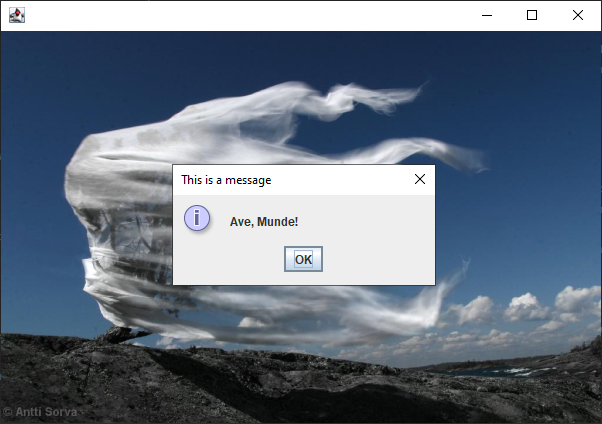
Auxiliary windows that are appear temporarily as part of a GUI are commonly known as dialogs (dialogi). Dialogs serve various purposes, such as displaying messages to the user, asking the user to choose between alternatives, or otherwise prompting for input.
Many dialogs are small windows that contain just a handful of elements whose layout follows a standard pattern. Message-displaying dialogs, for instance, often consist of a little icon, a message, and an OK button:
There’s a Dialog class in scala.swing; it’s similar to Frame. However, it often
isn’t necessary to instantiate this class directly, as the class’s companion object
provides a selection of convenient methods that cater to many common needs. Below is
an example of one of those methods, showMessage.
Dialog.showMessage(imageLabel, "Ave, Munde!", "This is a message")
showMessage’s first parameter specifies the dialog’s location:
which component the dialog should appear on top of? In this
example, we put the dialog on top of the image.
The other parameters specify the message to be displayed and the dialog’s title, respectively.
The above command creates a dialog and displays it. The dialog remains visible until the user presses OK or otherwise closes it.
An Application with A Swing GUI
So far, we did everything in the REPL. Now let’s look at saving a Swing application.
The code below demonstrates one way to put together an app that has the same two-button GUI that you saw in the previous example.
object ComponentTestApp extends SimpleSwingApplication:
  // Main components:
  val firstButton  = Button("Press me, please")( () )
  val secondButton = Button("No, press ME!")( () )
  val prompt = Label("Press one of the buttons.")

  // Component layout::
  val allPartsTogether = BoxPanel(Orientation.Vertical)
  allPartsTogether.contents ++= Vector(prompt, firstButton, secondButton)
  val buttonWindow = MainFrame()
  buttonWindow.contents = allPartsTogether
  buttonWindow.title = "Swing Test App"

  // A method that returns the app’s main window:
  def top = this.buttonWindow

end ComponentTestApp
The singleton ComponentTestApp represents our application;
it derives from SimpleSwingApplication. A SimpleSwingApplication
serves as the application’s entry point (cf. extends App;
Chapter 2.7).
We create the components just like we did in the REPL earlier,
except that we now use MainFrame where we had Frame
before. MainFrame is a subclass of Frame that represents
an application’s primary GUI frame. Closing a MainFrame
terminates the entire app (whereas closing a regular Frame
just hides that frame while the program keeps running),
which is desirable in this standalone app, but not in the REPL.
SimpleSwingApplication is an abstract class. Our app, which
inherits it, implements the superclass’s abstract top method,
whose return value specifies this app’s primary (“top-level”)
window. The superclass takes care of making that window visible
as soon as the app launches.
For that reason, we don’t need to write buttonWindow.visible = true
as we did in the REPL.
You’ll find this code in the SwingExamples module. Try running it and making changes.
Try writing Horizontal instead of Vertical, for instance.
An alternative notation: nested definitions
Chapter 7.5’s optional materials showed that it’s possible to define a single-use subclass “on the fly” as you instantiate it. The same trick also works for the Swing classes. For instance, the two snippets below do the same thing.
// Version 1: as above
val buttonWindow = MainFrame()
buttonWindow.contents = allPartsTogether
buttonWindow.title = "Swing Test App"
// Version 2: a new subtype of `MainFrame` and a single instance of it
val buttonWindow = new MainFrame:
  this.contents = allPartsTogether
  this.title = "Swing Test App"
Note the new keyword (Chapter 7.5).
You could well omit these explicit this
keywords. They aren’t mandatory here and
don’t really clarify this code either.
Here is the entire ComponentTestApp written in a more compact
style that highlights the nestedness of the components:
import scala.language.adhocExtensions

object ComponentTestApp extends SimpleSwingApplication:

  val firstButton  = Button("Press me, please")( () )
  val secondButton = Button("No, press ME!")( () )
  val prompt = Label("Press one of the buttons.")

  val buttonWindow = new MainFrame:
    title = "Swing Test App"
    contents = new BoxPanel(Orientation.Vertical):
      contents ++= Vector(prompt, firstButton, secondButton)

  def top = this.buttonWindow

end ComponentTestApp
The import is a workaround for an issue: the
Java classes that we exploit here haven’t been
declared open (Chapter 7.5), so we get a compiler
warning unless we okay that with an import.
Handling Events in Swing
Quick recap: GUI events, event handlers, and event listeners
From Chapter 3.1:
GUI events include mouse clicks and movements, key presses, and so forth.
An event handler is a subprogram that runs as a reaction to an event.
The
onClickandonTickmethods ono1.Viewobjects are examples of event handlers.
An event listener is an object that gets notified when a particular sort of event occurs and that reacts to those events by running an event handler.
An
o1.Viewobject serves as an event listener for itself: when something happens in the view, the object itself is notified and calls the appropriate event-handler method.
An easy way to attach handlers to buttons
Before we look at event handling in Swing more generally, let’s see a simple way to give
a Button some behavior. This trick is easy to write but only covers this basic scenario.
Our code currently says this:
val firstButton = Button("Press me, please")( () )
val secondButton = Button("No, press ME!")( () )
Where we now have the empty brackets, we can also write other things, such as a print command:
val firstButton = Button("Press me, please")( println("Thank you!") )
val secondButton = Button("No, press ME!")( println("Yay, you picked ME!") )
Now those print commands are, in effect, event handlers that the button objects run
when they are pressed. (That event-handling code gets passed to the buttons as a by-name
parameter; Chapter 7.2. The code gets evaluated upon each button-press event.) A Swing
Button knows how to serve as its own event listener.
It often makes sense to define a separate function for dealing with a particular sort of event. As an example, let’s write a function that pops up a dialog. You’ll find the complete example in the SwingExamples module; go ahead and try it if you want.
val firstButton = Button("Press me, please")( reactToPress() )
val secondButton = Button("No, press ME!")( reactToPress() )

def reactToPress() =
  val message = "You pressed one of the buttons."
  Dialog.showMessage(allPartsTogether, message, "Info")
What we’ve done here covers button clicks only. This approach also doesn’t give us access to further information about the event that occurred. So let’s now look at a more general and flexible way of dealing with events in Swing.
Swing’s GUI events
Swing’s GUI components recognize when a GUI event occurs. When a component observes an event, it automatically notifies its own event listeners of the fact. For the application programmer, it remains to decide:
Which object should be notified when an event occurs? In other words: which object or objects serve as event listeners for each Swing component?
This isn’t something we did with O1’s library, where each
Viewwas its own listener.
Which program code should the event listener run when, say, a button is clicked or the mouse cursor moves? In other words: what should happen as a consequence of each event?
When using
View, we’ve written this behavior in theView’s event-handler methods. We’ll do something similar in Swing.
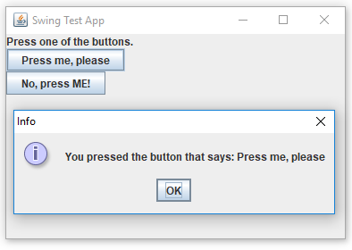
Let’s create a Swing GUI that looks similar to the ones we’ve just made but reacts to button-press events as follows:
It determines which button is the source of the press event and reports it in a dialog like this:
It updates the source button’s text by adding an exclamation mark at the end.
The program is given below, first as pseudocode and then as a concrete Scala program.
Handling events: pseudocode
object EventTestApp extends SimpleSwingApplication:

  val firstButton = Button("Press me, please")( () )
  val secondButton = Button("No, press ME!")( () )
  val prompt = Label("Press one of the buttons.")

  val allPartsTogether = BoxPanel(Orientation.Vertical)
  allPartsTogether.contents ++= Vector(prompt, firstButton, secondButton)
  val buttonWindow = MainFrame()
  buttonWindow.contents = allPartsTogether
  buttonWindow.title = "Swing Test App"

  // Events:

  Make this EventTestApp object receive notifications when either
  firstButton or secondButton is pressed.

  Specify that whenever this object is notified of any button press, it displays
  a dialog with the message “You pressed the button that says: [text on the button]”.
  Then it appends an exclamation mark to that button’s text.

  // A method that returns the app’s main window:
  def top = this.buttonWindow

end EventTestApp
We make the object an event listener for the two buttons. Metaphorically, it will keep its ears peeled and react to events from those buttons.
We give the event listener (i.e., the app object) an event handler that it runs when it hears about an event.
Let’s refine the pseudocode part:
  Make this EventTestApp object listen to events from firstButton.
  Make this EventTestApp object listen to events from secondButton.

  Give the EventTestApp an event handler that does the following:
    1. Have a local variable clickEvent store a reference to an object that details the event.
    2. Ask that event object to provide the event’s source: the button that was pressed.
    3. Ask the button object to provide the text written on it.
    4. Call Dialog.showMessage with the message “You pressed the button that says: [text]”.
    5. Form a new text for the button by adding ! and set that as button object’s new text.
Handling events: concrete Scala code
import scala.swing.*
import scala.swing.event.*

object EventTestApp extends SimpleSwingApplication:
  // Otherwise identical to the above.

  this.listenTo(firstButton, secondButton)
  this.reactions += {
    case clickEvent: ButtonClicked =>
      val clickedButton = clickEvent.source
      val message = "You pressed the button that says: " + clickedButton.text
      Dialog.showMessage(allPartsTogether, message, "Info")
      clickedButton.text = clickedButton.text + "!"
  }
end EventTestApp
We need tools from scala.swing.event.
Calling listenTo on a GUI component makes the component sign
up as an event listener. The parameter indicates the event source
that will be listened to. (You may pass multiple parameters;
here we pass two.)
reactions is a collection of event handlers. Here, we add one
handler to that collection.
We define the event-handling code within curly brackets.
The case keyword, previously familiar from match expressions,
comes in handy here.
ButtonClicked is a class from scala.swing.event. It represents
button-click events. clickEvent is a programmer-chosen name
for a variable that stores a reference to the event that is
being handled. (From the application programmer’s point of view,
clickEvent receives that value automatically; cf. match and
method parameters.) The type of clickEvent is ButtonClicked.
The entire line thus means this: “In case the event that occurred
is a ButtonClick, store a reference to the event object in
clickEvent and execute the following code:”
The event object’s source variable gives us the source of the
event — in this case, that means the button that was pressed.
The button object’s text variable gives us the string that’s
written on the button. We may also assign a new value to text
as shown.
You’ll find that code, too, in the SwingExamples module. Feel free to modify it and see what happens.
Event handlers in Scala
There are several ways to specify event handlers in Swing. We used that style because it’s the simplest given what we’ve covered in O1.
Other types of events
The package scala.swing.event contains not just ButtonClicked but a variety of
similar classes that correspond to a variety of GUI events. There’s MouseClicked,
MouseWheelMoved, MouseMoved, KeyTyped, and so on. You’ll find examples of
MouseClicked and MouseWheelMoved in the llama app, which we’ll return to presently.
Case Study: LlamaApp
You tried it already, right?
If you didn’t try LlamaApp at the beginning of the chapter, try
it now. The text below may be quite hard to follow unless you know
what the application looks like.
O1’s earlier chapters have repeatedly mentioned that an application can be divided into a user interface and an internal model. The user interface receives commands from the user and may modify the internal model as commanded.
Let’s start inspecting LlamaApp by looking at the model: the llama’s internal logic.
Class Llama
The app’s model has just a single class, Llama. We won’t pore over its implementation
details; a quick run-through of its interface will do:
A single instance of class
Llamarepresents a llama with a mutable state.A llama’s key characteristic is its patience level, which starts at one hundred percent.
The parameterless methods
tickle,poke, andslapeach negatively impact the llama’s patience.The parameterless
isOutOfPatiencemethod indicates whether the llama has completely blown its lid.The
stateOfMindmethod — likewise parameterless — returns a string that describes the llama’s commentary on the world.
The GUI components
The app’s GUI should do the following:
display an image of a llama and, above it, a text that indicates the llama’s state of mind;
offer the user the chance to scratch (with the mouse wheel), poke (with the mouse button), or, if the user is nasty, slap (double-click) the llama;
enable the user to create a new llama by pressing Again!.
The following code lays out the GUI components. The event-handling code isn’t there yet.
object LlamaApp extends SimpleSwingApplication:
  // A couple of images:
  val alivePic = ImageIcon(this.getClass.getResource("pics/alive.jpg"))
  val deadPic  = ImageIcon(this.getClass.getResource("pics/dead.jpg"))

  // Access to the model (internal logic of the app):
  var targetLlama = Llama()

  // Components:
  val commentary = Label()
  val pictureLabel = Label()
  val startOverButton = Button("Again!")( () )
  this.updateLlamaView()

  // Layout:
  val verticalPanel = BoxPanel(Orientation.Vertical)
  verticalPanel.contents ++= Vector(commentary, pictureLabel, startOverButton)
  val llamaWindow = MainFrame()
  llamaWindow.title = "A Llama"
  llamaWindow.resizable = false
  llamaWindow.contents = verticalPanel

  def top = this.llamaWindow

  private def updateLlamaView() =
    this.commentary.text = targetLlama.stateOfMind
    this.pictureLabel.icon = if this.targetLlama.isOutOfPatience then this.deadPic
                                                                 else this.alivePic
end LlamaApp
The app loads a couple of image files from the package into
ImageIcon objects.
The GUI needs to operate on the application’s internal model.
The model consists of a single Llama object (at a time).
The GUI window contains two Labels (one with a text and
another with an image) and one button.
We put lay out those elements in a panel and make set that panel as the window’s contents.
Setting resizable to false locks the window’s dimensions:
the user can’t resize the window by dragging its sides with the
mouse, for example.
updateLlamaView is a helper method that determines which
text and image to display, given the llama’s current state,
and updates the two labels accordingly.
Mouse and button events
Adding the following lines in LlamaApp makes it work as we intended.
this.listenTo(startOverButton)
this.listenTo(pictureLabel.mouse.clicks, pictureLabel.mouse.wheel)
this.reactions += {
  case moveEvent: MouseWheelMoved =>
    targetLlama.scratch()
    updateLlamaView()

  case clickEvent: MouseClicked =>
    if clickEvent.clicks > 1 then    // double-click (or triple, etc.)
      targetLlama.slap()
    else
      targetLlama.poke()
    updateLlamaView()

  case clickEvent: ButtonClicked =>
    targetLlama = Llama()
    updateLlamaView()
}
The LlamaApp object listens to both mouse-button events
and mouse-wheel events.
We describe the sorts of events that the app object may hear about: mouse-wheel movements, mouse clicks, and presses of the GUI button. We give each case its own event-handler code.
We invoke the helper method after each event so that the GUI updates to reflect the changes made to the model.
Another Example: Random Text
Let’s look at another application. We’ll begin from the RandomTextGenerator class,
which you’ll find in package o1.randomtext.
A RandomTextGenerator object generates text that more or less looks like natural human
language but is nonsensical enough that it has entertainment value at best.
These objects have a randomize method, which receives a local file name or network URL
as a parameter, reads existing text from that source, and returns a string of random text
that resembles the input. (You’ll see examples if you fix the app in the small practice
task below.)
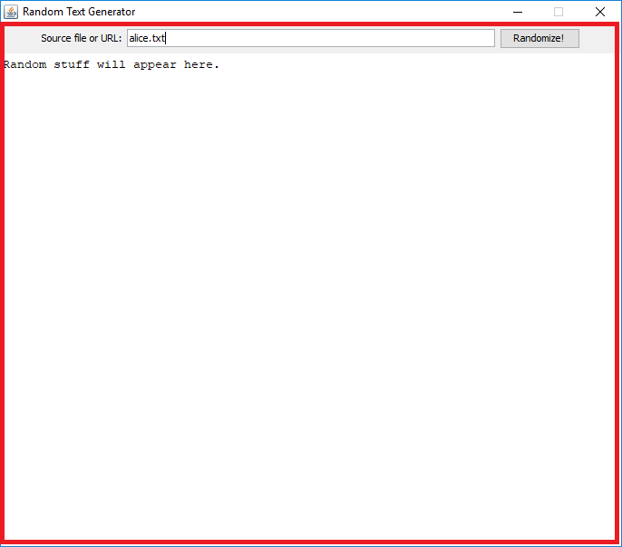
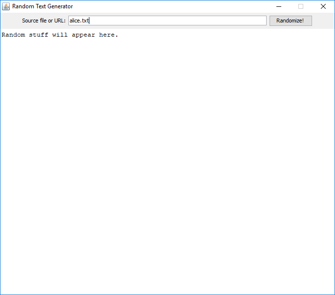
Let’s aim for a GUI that looks like this:
We have two new challenges here:
How to display a single-line text field and a multi-line text area? The random text should appear in the latter when the user presses the Randomize! button.
How to lay out the components so that the prompt, the text field, and the button appear as a single row at the top while the text area fills the rest of the window?
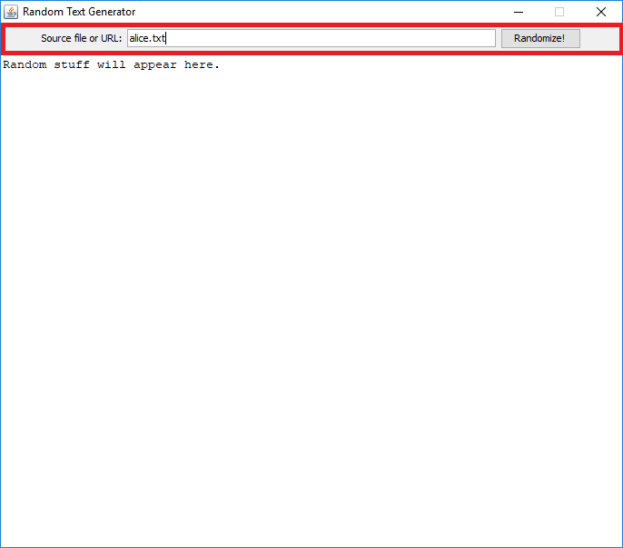
Let’s consider the second problem first. The solution is ultimately the same as before: panels. Two panels were use used to construct the above window:
We again have a vertical BoxPanel as the window’s contents.
It contains two things: the upper row and a large TextArea
component.
The upper row is another panel; it contains a Label with text,
a TextField and a Button. More specifically, this panel is
of type FlowPanel. We could have used a horizontally aligned
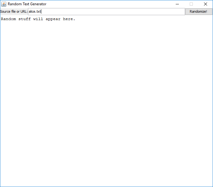
BoxPanel here instead, but...
... the result would have looked like this. A BoxPanel stretches
its contents to the panel’s edges, which doesn’t look as nice in
this case.
Here’s the Scala code that lays out the components:
object RandomTextApp extends SimpleSwingApplication:
  // Components:
  val prompt = Label("Source file or URL:")
  val sourceField = TextField("alice.txt", 50)
  val randomizeButton = Button("Randomize!")( () )
  val outputArea = TextArea("Random stuff will appear here.", 30, 85)
  outputArea.editable = false
  outputArea.lineWrap = true

  // Layout:
  val topRow = FlowPanel()
  topRow.contents ++= Vector(prompt, sourceField, randomizeButton)
  val wholeLayout = BoxPanel(Orientation.Vertical)
  wholeLayout.contents ++= Vector(topRow, outputArea)

  val window = MainFrame
  window.title = "Random Text Generator"
  window.resizable = false
  window.contents = wholeLayout

  def top = this.window
end RandomTextApp
Note classes TextField and TextArea. The constructor
parameters specify the widths of these components as well as
the number of tow in the text area.
We mean for the computer to generate content in outputArea.
We therefore set the text area’s editable property to false,
which prevents the user from editing what’s written there. The
lineWrap property allows the component to split long lines
of text across multiple lines automatically.
FlowPanel gives us a somewhat nicer-looking GUI here than
BoxPanel.
BoxPanel works fine for positioning the top-row panel above the
text area.
There’s a copy of this program in o1.randomtext in the SwingExamples module.
But it looks ugly when I run it
If you try running that app in SwingExamples, you may find that the GUI doesn’t look quite like the image above. The components do appear in those positions but the components look displeasingly “retro” and unlike your operating system’s other windows and buttons. Why is that?
The underlying issue is that different environments display windows and other GUI components somewhat differently. (For instance, GUIs look similar yet obviously different on a Windows than on a Mac.) In other words, GUIs in different environments have a different look and feel.
Swing lets you choose between several look-and-feel settings. By default, Swing uses a so-called cross-platform look and feel. If you’re unsatisfied with those visuals, you need to select a different option.
Let’s edit RandomTextApp so that it starts like this:
 import javax.swing.UIManager

object RandomTextApp extends SimpleSwingApplication:
  UIManager.setLookAndFeel(UIManager.getSystemLookAndFeelClassName)
  // ...
UIManager provides services related to
the GUI’s surrounding graphical environment.
Here, we use UIManager’s methods to...
... find out which look and feel matches the environment where the program is currently running, and...
... to indicate that we want our app to have that look and feel, too.
If you add those instructions to RandomTextApp, the program
should look like you’d expect programs to look like in your
operating system. That is, this version of the program doesn’t
use Swing’s default visuals but adapts to whichever environment
you run it in.
Assignment: Fix RandomTextApp
Fill in the missing parts of RandomTextApp so that it works as
described the comments in the code. More specifically:
Try the app as given. The GUI components are there, but the program doesn’t really do anything.
The program should churn out nonsense text when the user presses the button. To produce the text, you’ll need a
RandomTextGeneratorobject produce the text, so link theRandomTextAppobject to an instance ofRandomTextGenerator.Cf. how
LlamaAppstored a reference to aLlamaobject.Pass the integer 9 as a constructor parameter to the generator. The parameter’s meaning is described in the comments. Feel free to experiment with values other than nine on your own.
Write a parameterless function that does the things that are supposed to happen when the button is clicked. Pick a name for your function (e.g.,
onRandomizeClick). It must do the following:Generate nonsense text by calling
randomizeon the generator. As a parameter, pass in the text that’s insourceField. You can access that string via the text field’stextproperty.Put the nonsense in
outputAreaby setting the text area’stextproperty.
Make the program react by calling the function you just wrote whenever the button is pressed (
ButtonClicked). Try one or both of the approaches covered in the previous examples:Make the
RandomTextAppobject listen to button clicks (listenTo). Add acasetoRandomTextApp’sreactionsso that your function gets called.Or keep it simple: just write the function call you need directly into the command that creates the
Buttonin the first place.
Test the program. If everything went well, you’ll see some output when you press Randomize!
Since we set the text area’s
lineWrapproperty totrue, the long output string splits across multiple lines. However, there’s no respect for word borders, which makes the text annoying to read. Fix the matter by also enablingwordWrapon the text area.
A+ presents the exercise submission form here.
User Interfaces as Tips of Icebergs
In 2002, Joel Spolsky, a well-known blogger and one of the founders of the question-and-answer site Stack Overflow, wrote about the Iceberg Secret of commercial software projects. Now that you’ve learned something about programming and user interfaces, this bit of arcana is within your reach.
You know how an iceberg is 90% underwater? Well, most software is like that too — there’s a pretty user interface that takes about 10% of the work, and then 90% of the programming work is under the covers.
That’s not the secret. The secret is that People Who Aren’t Programmers Do Not Understand This.
There are some very, very important corollaries to the Iceberg Secret.
Important Corollary One. If you show a nonprogrammer a screen which has a user interface that is 90% worse, they will think that the program is 90% worse.
Important Corollary Two. If you show a nonprogrammer a screen which has a user interface which is 100% beautiful, they will think the program is almost done.
This is one of the reasons why it’s good that ever more citizens know at least a little about programming.
Summary of Key Points
Programmers use various libraries for building graphical user interfaces. One such library is called Swing.
Many GUI libraries provide components such as windows, buttons, and text fields. Swing is object-oriented and represents these concepts as classes.
When you lay out components in a GUI window, it’s often helpful to group components together using auxiliary components known as panels.
You can make a GUI can react to user actions — GUI events — by designating an object to serve as a so-called event listener.
For example, when a button is clicked, the corresponding button object informs its event listeners of that event.
When it’s notified of an event, the listener object runs some event-handler code that defines what should happen as a response to that sort of event.
Links to the glossary: graphical user interface (GUI); GUI event, event listener, event handler; Swing.
I want more!
As far as GUIs are concerned, O1’s official learning objectives are modest. We haven’t gone deeper into this topic, because GUI programming tends to demand quite a bit of familiarity with the details of specific GUI libraries. To spend time building that familiarity isn’t optimal for our main goal of learning more generic skills and concepts.
You can learn more about GUIs and Swing on your own and in the course Programming Studio 2.
You may also want to explore the given GUIs in O1’s modules. Many of those GUIs feature techniques not covered in this chapter (such as creating new component types by inheriting them from Swing’s classes).
Feedback
Please note that this section must be completed individually. Even if you worked on this chapter with a pair, each of you should submit the form separately.
Credits
Thousands of students have given feedback and so contributed to this ebook’s design. Thank you!
The ebook’s chapters, programming assignments, and weekly bulletins have been written in Finnish and translated into English by Juha Sorva.
The appendices (glossary, Scala reference, FAQ, etc.) are by Juha Sorva unless otherwise specified on the page.
The automatic assessment of the assignments has been developed by: (in alphabetical order) Riku Autio, Nikolas Drosdek, Kaisa Ek, Joonatan Honkamaa, Antti Immonen, Jaakko Kantojärvi, Onni Komulainen, Niklas Kröger, Kalle Laitinen, Teemu Lehtinen, Mikael Lenander, Ilona Ma, Jaakko Nakaza, Strasdosky Otewa, Timi Seppälä, Teemu Sirkiä, Joel Toppinen, Anna Valldeoriola Cardó, and Aleksi Vartiainen.
The illustrations at the top of each chapter, and the similar drawings elsewhere in the ebook, are the work of Christina Lassheikki.
The animations that detail the execution Scala programs have been designed by Juha Sorva and Teemu Sirkiä. Teemu Sirkiä and Riku Autio did the technical implementation, relying on Teemu’s Jsvee and Kelmu toolkits.
The other diagrams and interactive presentations in the ebook are by Juha Sorva.
The O1Library software has been developed by Aleksi Lukkarinen, Juha Sorva, and Jaakko Nakaza. Several of its key components are built upon Aleksi’s SMCL library.
The pedagogy of using O1Library for simple graphical programming (such as Pic) is
inspired by the textbooks How to Design Programs by Flatt, Felleisen, Findler, and
Krishnamurthi and Picturing Programs by Stephen Bloch.
The course platform A+ was originally created at Aalto’s LeTech research group as a student project. The open-source project is now shepherded by the Computer Science department’s edu-tech team and hosted by the department’s IT services; dozens of Aalto students and others have also contributed.
The A+ Courses plugin, which supports A+ and O1 in IntelliJ IDEA, is another open-source project. It has been designed and implemented by various students in collaboration with O1’s teachers.
For O1’s current teaching staff, please see Chapter 1.1.
Additional credits appear at the ends of some chapters.



The
Button-creating command has two parameter lists. Within the first, we pass in the next we want the button to have. And within the second...